Giving HireHunch a Distinct Voice in Technical Hiring
Technical hiring is a complex space to communicate. The audience needs to understand not just what a product does, but why conventional hiring approaches fall short and how a different approach can help. HireHunch needed a recognisable brand presence across its product communication and social media. Working as the sole graphic designer, I collaborated with Business Development to define brand assets and partnered with Marketing to translate product messaging and industry perspectives into engaging visual creatives. My role spanned brand asset development, creative direction, visual execution, and ongoing marketing communication.
I approached the work as a communication problem rather than a series of isolated design requests.
The approachAs the sole graphic designer, I worked across two connected responsibilities: helping define brand assets with Business Development and delivering ongoing social media creatives with Market…
The outcomeThe key design consideration was choosing the right visual device for the communication objective.
The Challenge
I approached the work as a communication problem rather than a series of isolated design requests. Each creative needed a clear central message, a visual concept that reinforced it, and a hierarchy that made the content easy to scan.
The challenge was to maintain a recognisable brand presence while adapting the visual treatment to different purposes: explaining product capabilities, challenging conventional thinking about technical interviews, and connecting with audiences during cultural occasions.
The Process
01Establishing a recognisable brand presence
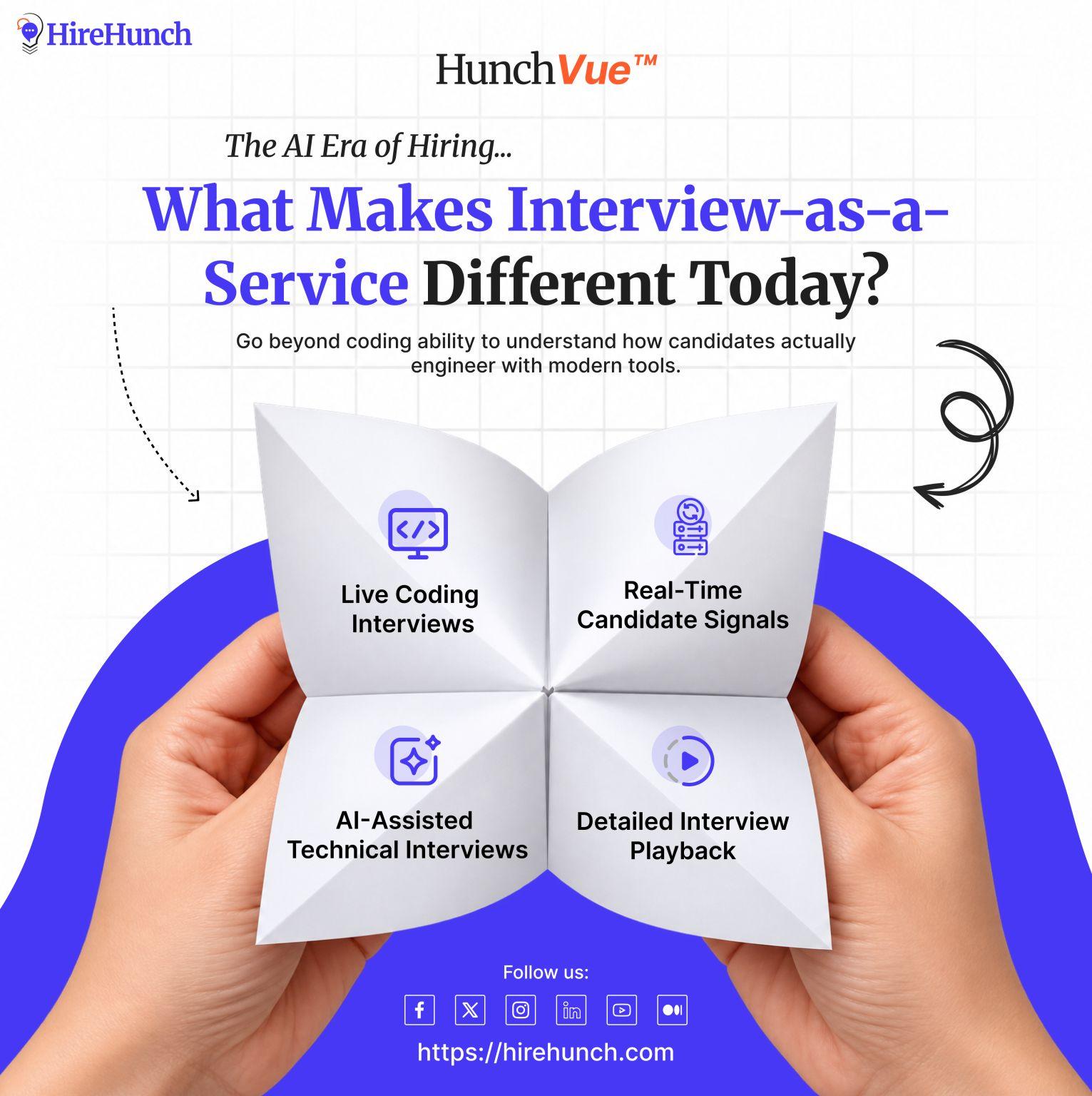
I worked with Business Development to define brand assets that could support HireHunch's communication needs. Across the supplied creatives, the visual language uses purple and orange accents, bold display typography, contrasting text treatments, and recurring brand placement.
The aim was to give different messages a recognisable visual connection without making every creative look identical.
02Turning technical concepts into visual stories
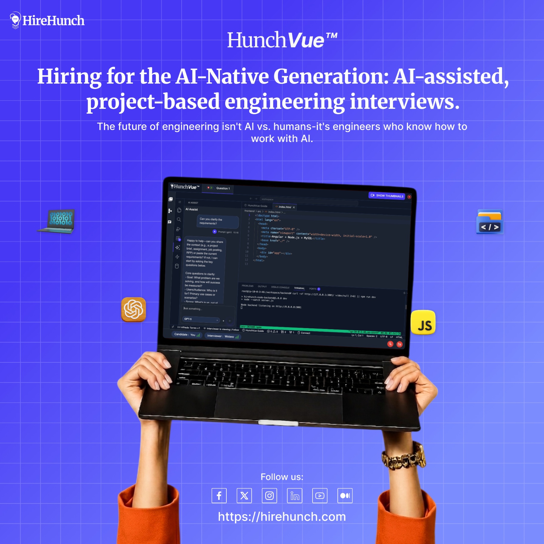
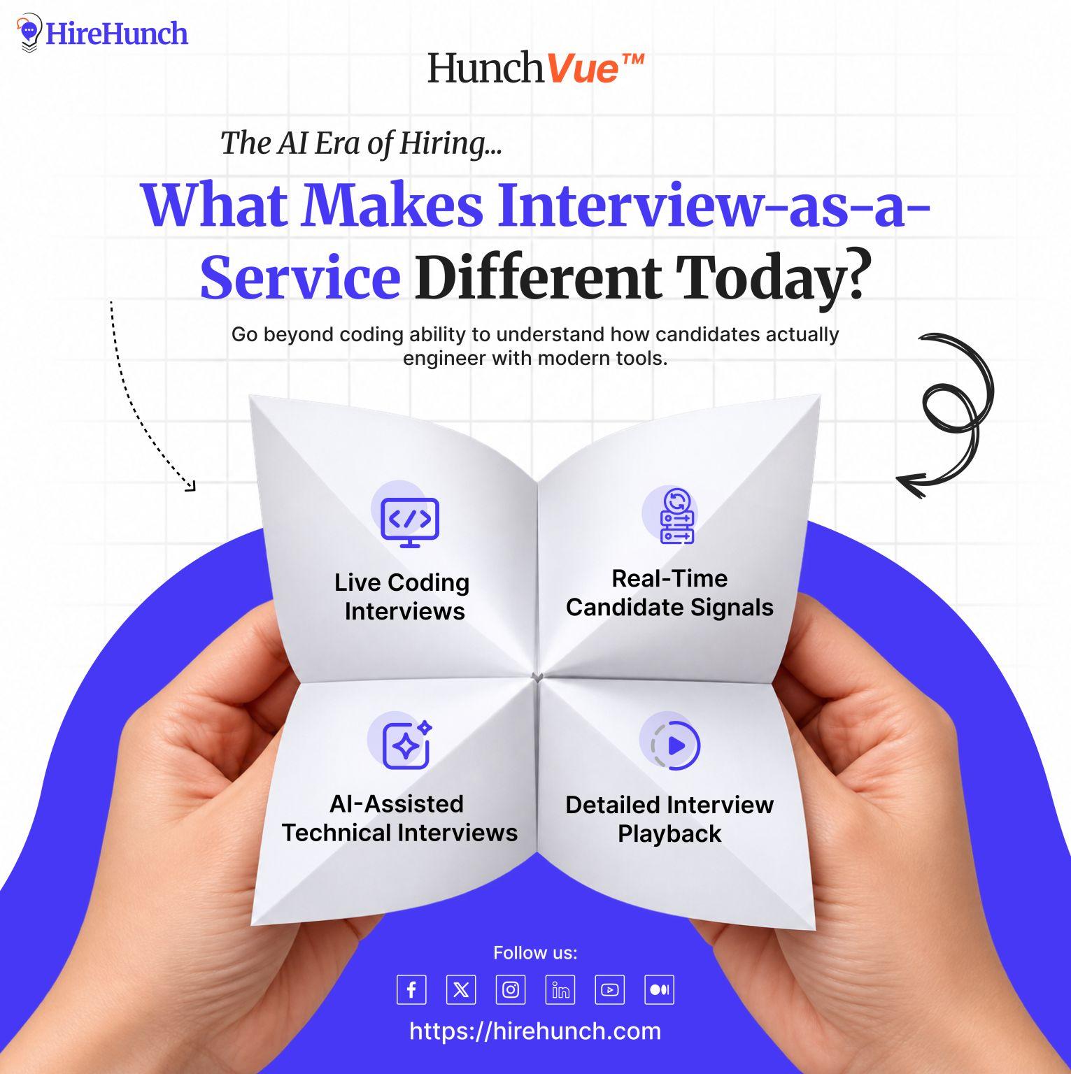
For HunchVue, I explored messaging that shifts attention from solving isolated coding questions to demonstrating real engineering ability.
The creative “You're Hiring Engineers, Not Coding Contest Winners” establishes this contrast through a strong headline, while supporting content introduces practical workflows such as working with codebases, debugging, and integrating APIs.
Another creative, “The Best Engineers Don't Rush to Code,” uses questions about system design, traffic, failures, and requirements to illustrate the value of understanding a problem before solving it.
Rather than relying on feature lists alone, these designs use a point of view to make the product's relevance easier to understand.
03Making an invisible problem tangible
For HunchServe, I used an hourglass as the central visual metaphor for the hidden cost of technical interviews.
Supporting elements—packed calendars, delayed features, and slower feedback—connect the passage of time to the operational consequences described in the copy.
The concept gives an abstract business problem a concrete visual representation, allowing the headline and imagery to work together rather than compete for attention.
04Extending the brand into cultural moments
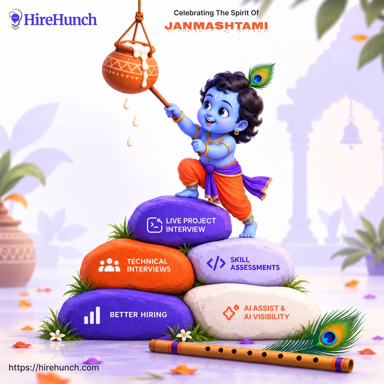
The Dussehra and Janmashtami creatives take a different approach, using familiar cultural imagery to create occasion-specific communication.
The Dussehra design builds around a central mythological figure, a warm sunset, and an orange-led landscape. The Janmashtami design combines Krishna imagery with a stack of stones carrying product-related messages.
Both designs prioritise a recognisable festive focal point while retaining HireHunch branding.

The Solution
HunchVue
Product storytelling
HunchServe
Problem-led communication
Seasonal campaigns
Brand expression
The Contribution
As the sole graphic designer, I worked across two connected responsibilities: helping define brand assets with Business Development and delivering ongoing social media creatives with Marketing.
The work demonstrates my ability to move between brand consistency, product storytelling, visual metaphor, and campaign-specific art direction while adapting the creative treatment to the message.
Impact & Reflection
The key design consideration was choosing the right visual device for the communication objective. Product-led creatives relied on strong headlines and structured information; HunchServe used a central metaphor to explain an operational problem; seasonal designs relied on cultural imagery and atmosphere.
A natural next step would be to formalise the recurring visual elements into documented brand guidelines and evaluate which creative approaches generate stronger engagement using actual campaign data.